Smacking art right in the stupid face, unsurpassed

Artwork, Stream News

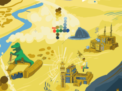
Here we are, starting out summer right. It’s been a productive year so far, artistically and professionally. As I demand more detail in my own artwork, it also demands more time, so I have fewer pieces to show, but the pieces I have worked on I am very proud of. Check out the gallery for updates and the pieces that I have worked on thus far!

This is all besides the fact that I am not an artist alone, but rather an artist, a musician, a father and husband, a writer, and a damn good home cook. I see growth in any of these fields as growth in all of these fields. It’s the holistic approach that works for me. It also staves off burnout, since I am not dedicating myself to any one thing for too long. The flip side of this is that it can make it harder to work on larger projects and maintain laser focus; this does not bother me as much, since on this front I am my own boss and I am very generous with my deadlines. As long as things are getting done, I’m happy.


Artistically, I have learned more about shading, workflow, animation, and the overall business side of it. Musically, I have learned how to better use loops to make songs, and I feel more confident than ever playing live on stream. Speaking of my stream, I have added gaming to the lineup. My setup is getting closer and closer to what I would consider “professional”, so I can add more and more content and feel like I’m contributing something meaningful. Mondays I stream animation and artwork, Thursdays I play keyboard and work on music loops, and every other day (and nights, usually very late) I can play some games! Lately I have been playing a Dark Souls 1 randomizer run, and I want stream more interesting mods of popular games in the future. It’s a challenge in every sense… but I don’t know how to stop creating.

Oh and I have a new mic! A Yeti Blue! Makes me sound so much better than the microphone I was using before, which was actually part of my headset. I even have a pop screen. That makes it so I can draw and play piano and most of that white noise just disappears. I listen to myself on the stream recordings afterwards and you can really tell there is a great deal of improvement. Makes it easier to do everything!

Thanks for coming by. Godrod Studios is still active and happy. Here’s a sketch of Domo to keep you warm at night until next time!

DOMO!!!

Commissions, and the Ethical Bounds of Creating

Uncategorized

Hi everyone. Time for another minor update before I go HAM on a larger one.

Reeling from the news from yesterday about the school shooting. I’m not just tired of the killings, I am tired of the overwhelming inaction, the tacit acceptance of death. We saw it with the (still ongoing) pandemic, we see it with gun violence, and soon we will see it as climate disaster grows more and more dire. People my age and younger have never seen a functional Congress or judiciary, and it is very obvious to most of us that there is no incentive for them to improve the lives of the general population.

I wish I knew the answers to all of our problems. I don’t. I know the addiction to infinite growth on a finite planet will kill us all. Personally, I have stopped eating beef and I am cutting down considerably on other meats, I only drive when there is no other option, and I minimize water and electricity use. I took the pandemic seriously and did everything I could to assure that I would not unintentionally kill others, by getting vaccinated and wearing masks and staying out of enclosed public places. That is what I can do personally, in my small sphere. It is so, so hard to think that I am making any difference, and I know I am not alone in that feeling.

With all this in mind, I had to refuse a few commission ideas recently because they wanted to portray suicide. Light hearted, jokey suicide, but that still sat wrong with me. And I have been working on things that are actually rather violent and grim! It’s a personal line that I cannot cross anymore. Long ago I had a character I would draw called Dex, and he had a friend named Suicidal Vinny who would perpetually have a pistol pointed at his own head as he went about his day. Vinny would take any opportunity to end it all by firing the gun, but some twist of fate always intervened to save his life. That was high school and in retrospect, it was coming from a very dark place. As an adult I would rather not feed these sorts of thoughts, and I certainly do not want to create a looping animation of graphic self-harm. My current limit for what I will do is “Looney Tunes but with optional gore”.

Lastly, things I would like to get done on this site:

  • Update the PixelArt page. I have done more pixel art animation than anything lately and I need to showcase that more clearly
  • Facelift the site completely? This is one of those things that is both more and less work than it sounds.
  • Update my Commissions Page to be more beautiful and user-friendly

Examination and self-review; My Fallout New Vegas Piece Pt. 2

Artwork, Stream News

Hi everyone, I’m writing again! The piece has been completed, and I can now go into all the details about the process! Just like last time, I will speak about the progression, my thought process, and what details I chose to add or omit. Let’s take a look!

We left on version 9, and version 10 is not all that different from afar. However, this is the point where the placement and coloration was more or less set. I decided begin the long process of inking the piece. I went to my sloppy rough draft inks that I used to block the piece out, set them to a lower opacity (20-50% depending on the colors beneath it) and went in with a finer brush. All that mattered at this point was getting in the fine lines. I would go by my original inks, while looking at a photo reference. In some cases, I would literally plop the reference on the piece and trace over portions of it. I did that for maybe 15% of the linework, but most of it was done by hand.

I moved up and around, inking in all the areas in their final positions. In version 11 I completed the rest of the Strip, REPCONN, some of Goodsprings, and more. I blocked in a little color on the strip to make sure my dark areas were not disruptive. These next few versions look like tiny changes, but it was the backbone of everything that was yet to come. If we zoom in on the REPCONN facility, we can see the differences that an hour of linework can make:

See the difference between the rough and final drafts? It’s pretty major. I think I could save myself time in the future by keeping my rough drafts even rougher. You can see in the third image above that the established palette was paying dividends, allowing me to quickly describe the space without having to rely heavily on references for colors.

Step 5: Giving New Vegas Weight

Now we are starting to see some leaps and bounds in terms of settling on detail! At this point, most all of the linework has been completed. This includes the solar panels (but not the guns) in the foreground. Clockwise from the Strip, I have completed the major locations except the Fort, Nipton, Primm, and Quarry Junction. I also realized around this time that the white cross in the center of the piece was in the wrong location; in the end it was cut from the piece, since moving it would create too much interest smashed into the right side of the piece.

There was, at this point, what I like to call the “work” part of “artwork”. There was lots of linework that took place in very small spaces, so progress felt very slow. I would take a break on one area and work on another if I got restless. Often during the hop from version 13 to 15, I would find myself contouring the land, trying to make each town feel like an attractive space of its own. At some point I picked up all of Goodsprings and shifted it to the left, and I used that time to cut the Yangtze memorial cross out of the piece. I also shifted the brown bottle in the foreground into the frame a little bit, since it was interesting and recognizable.

In this period of time, I did a great deal of work on the Fort, the foreground elements, and in tightening up my colors. We decided to add a little bit of flavor to Red Rock Canyon, which was not an original plan. The addition of the red color was welcome though, and it let us add a little more Fallout flavor to the piece. What was once intended to be just a red cliff turned into a very neat visual element, that also steers us through the piece via colors (more on that at the end!) I thought I was almost done at this point, but I had 5 more versions left!

Step 6: One Million Finishing Touches, and a discussion on Palette

By this point I had been working on the piece for several weeks. Deciding that I needed to wrap this up, I started to add details. It was time to add characters populating the world, shade and light. Throughout all of it, I was happy I had the foresight to start a palette early, as it greatly reduced friction. I didn’t have to stop and think about every new city or landscape portion; I looked at the palette and applied it as needed. There are, of course, a few off-label colors, primarily in signage and the strip, but for the most part the entire final drawing is limited to the 28 colors you see here:

12 in the “brown-yellow” group
6 in the “red” group
3 in the green group
7 in the blue group

The brown yellows were the most diverse color group since they had so much to describe. They are used for buildings, the desert, the mountains, and more. I chose the colors to be moderately desaturated, for two reasons. One, I think that it reflects the mood and the actual darkness of the game itself. Two, bright yellows can appear gaudy and bright if they are not mixed with some gray, especially when they are printed! In addition, the desaturated colors will mix well into browns as you add more and more black into the mix. As a result, the piece has a harmony to it from the continuous spread of colors from the bright white-yellow to the darkest browns.

The reds I called “Sloan reds”, since I came up with the colors while working on the rusted and painted metal that made up that small town. Red was sparsely used in this piece, but when we look at the finished piece we can see that it had an impact in the way it draws attention across the piece diagonally.

The blues were vital for shading the mountain, New Vegas Strip, and the foreground. Most of the linework was done in the darkest blue color. I try to avoid using straight-up black lines, since they end up standing out too much. I ended up using blue for anything that I needed to describe as glass, metal, or water.

The versions look really close to one another now, so I will skip ahead from v16 to v18. The big differences are in the landscape near the statues in the back, the glow-up of the Lucky 38 tower (the big blue one), and making the Strip look more lived-in and full of life. I also was going in, adding additional shadows and linework. You can see that I started adding hatchwork into the landscape, blending areas together and making the piece look more unified. It can be a struggle to take so many disparate elements and make a single composition with them.

All of that work got us to here! While I am excited to speak about the final, I think this article is already very long. I will follow up soon with a short discussion about the color choices, and my goals in getting the eye to wander over the piece. Thanks for reading! Please check out the rest of my work, send me a message, leave a comment, order a drawing for yourself!

It is Impossible To Stop Now

Artwork, Stream News

Hi everyone, guess what? Stopping now is out of the question. Isn’t that great?

Growing is a process that is so baked in to human character, that you do not always feel it happen. Progress is often incremental, and time often passes quickly. When I compare my new work to the old, I see the refinement of my style. Like a piece of land eroded by millions of years of water and tectonics, my mental palette of design choices had settled into something that I can call my own. There are limitations, and there are strengths.

So great, how did I develop that style and why am I so happy with myself all of the sudden? Iterations! Practice! Discipline! And lots of sacrifice. Sacrifice of game nights, of sleep, of time spent with friends.

I am working on my Fallout: New Vegas landscape diligently, and it is looking fantasmic if you ask me.

Work in progress, 2021 by Ben Sutter

My next post will be detailing my process, looking at this drawing from its fuzzy beginnings to a stellar finish. In the mean time, thanks for checking in!

Sexual Liquid

Updating Godrod.org

Coloring Cuisine, Stream News

The gallery has been updated with a nice selection of what I have done this year. There is a lot I have left out, but what is there should give you an idea of the growth that I have been going through as an artist and otherwise.

Due to technical limitations, I am not getting music on the stream yet. I will continue to practice as much as my left wrist will allow. I’m about 10 weeks out from surgery on the left wrist, about 5 months out from the right wrist. Having the use of my wrist is amazing! I can draw and play and cook and love and clap and climb and have confidence again. Yay!

Priorities for 2020: Now that I more confidence in what I am doing, I plan on selling certain designs on T-shirts. I want to see what they look like and how the return/payment options are before I commit to a certain vendor. Look out for those, I love wearing art, it can help justify the art as being ‘useful’ as clothing if the pragmatic part of your brain tends to do the driving.

Thanks for checking out godrod.org. We have fun here.