Smacking art right in the stupid face, unsurpassed

Artwork, Stream News

Here we are, starting out summer right. It’s been a productive year so far, artistically and professionally. As I demand more detail in my own artwork, it also demands more time, so I have fewer pieces to show, but the pieces I have worked on I am very proud of. Check out the gallery for updates and the pieces that I have worked on thus far!

This is all besides the fact that I am not an artist alone, but rather an artist, a musician, a father and husband, a writer, and a damn good home cook. I see growth in any of these fields as growth in all of these fields. It’s the holistic approach that works for me. It also staves off burnout, since I am not dedicating myself to any one thing for too long. The flip side of this is that it can make it harder to work on larger projects and maintain laser focus; this does not bother me as much, since on this front I am my own boss and I am very generous with my deadlines. As long as things are getting done, I’m happy.


Artistically, I have learned more about shading, workflow, animation, and the overall business side of it. Musically, I have learned how to better use loops to make songs, and I feel more confident than ever playing live on stream. Speaking of my stream, I have added gaming to the lineup. My setup is getting closer and closer to what I would consider “professional”, so I can add more and more content and feel like I’m contributing something meaningful. Mondays I stream animation and artwork, Thursdays I play keyboard and work on music loops, and every other day (and nights, usually very late) I can play some games! Lately I have been playing a Dark Souls 1 randomizer run, and I want stream more interesting mods of popular games in the future. It’s a challenge in every sense… but I don’t know how to stop creating.

Oh and I have a new mic! A Yeti Blue! Makes me sound so much better than the microphone I was using before, which was actually part of my headset. I even have a pop screen. That makes it so I can draw and play piano and most of that white noise just disappears. I listen to myself on the stream recordings afterwards and you can really tell there is a great deal of improvement. Makes it easier to do everything!

Thanks for coming by. Godrod Studios is still active and happy. Here’s a sketch of Domo to keep you warm at night until next time!

DOMO!!!

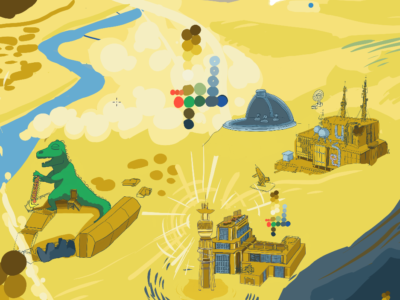
Examination and self-review; My Fallout New Vegas Piece Pt. 2

Artwork, Stream News

Hi everyone, I’m writing again! The piece has been completed, and I can now go into all the details about the process! Just like last time, I will speak about the progression, my thought process, and what details I chose to add or omit. Let’s take a look!

We left on version 9, and version 10 is not all that different from afar. However, this is the point where the placement and coloration was more or less set. I decided begin the long process of inking the piece. I went to my sloppy rough draft inks that I used to block the piece out, set them to a lower opacity (20-50% depending on the colors beneath it) and went in with a finer brush. All that mattered at this point was getting in the fine lines. I would go by my original inks, while looking at a photo reference. In some cases, I would literally plop the reference on the piece and trace over portions of it. I did that for maybe 15% of the linework, but most of it was done by hand.

I moved up and around, inking in all the areas in their final positions. In version 11 I completed the rest of the Strip, REPCONN, some of Goodsprings, and more. I blocked in a little color on the strip to make sure my dark areas were not disruptive. These next few versions look like tiny changes, but it was the backbone of everything that was yet to come. If we zoom in on the REPCONN facility, we can see the differences that an hour of linework can make:

See the difference between the rough and final drafts? It’s pretty major. I think I could save myself time in the future by keeping my rough drafts even rougher. You can see in the third image above that the established palette was paying dividends, allowing me to quickly describe the space without having to rely heavily on references for colors.

Step 5: Giving New Vegas Weight

Now we are starting to see some leaps and bounds in terms of settling on detail! At this point, most all of the linework has been completed. This includes the solar panels (but not the guns) in the foreground. Clockwise from the Strip, I have completed the major locations except the Fort, Nipton, Primm, and Quarry Junction. I also realized around this time that the white cross in the center of the piece was in the wrong location; in the end it was cut from the piece, since moving it would create too much interest smashed into the right side of the piece.

There was, at this point, what I like to call the “work” part of “artwork”. There was lots of linework that took place in very small spaces, so progress felt very slow. I would take a break on one area and work on another if I got restless. Often during the hop from version 13 to 15, I would find myself contouring the land, trying to make each town feel like an attractive space of its own. At some point I picked up all of Goodsprings and shifted it to the left, and I used that time to cut the Yangtze memorial cross out of the piece. I also shifted the brown bottle in the foreground into the frame a little bit, since it was interesting and recognizable.

In this period of time, I did a great deal of work on the Fort, the foreground elements, and in tightening up my colors. We decided to add a little bit of flavor to Red Rock Canyon, which was not an original plan. The addition of the red color was welcome though, and it let us add a little more Fallout flavor to the piece. What was once intended to be just a red cliff turned into a very neat visual element, that also steers us through the piece via colors (more on that at the end!) I thought I was almost done at this point, but I had 5 more versions left!

Step 6: One Million Finishing Touches, and a discussion on Palette

By this point I had been working on the piece for several weeks. Deciding that I needed to wrap this up, I started to add details. It was time to add characters populating the world, shade and light. Throughout all of it, I was happy I had the foresight to start a palette early, as it greatly reduced friction. I didn’t have to stop and think about every new city or landscape portion; I looked at the palette and applied it as needed. There are, of course, a few off-label colors, primarily in signage and the strip, but for the most part the entire final drawing is limited to the 28 colors you see here:

12 in the “brown-yellow” group
6 in the “red” group
3 in the green group
7 in the blue group

The brown yellows were the most diverse color group since they had so much to describe. They are used for buildings, the desert, the mountains, and more. I chose the colors to be moderately desaturated, for two reasons. One, I think that it reflects the mood and the actual darkness of the game itself. Two, bright yellows can appear gaudy and bright if they are not mixed with some gray, especially when they are printed! In addition, the desaturated colors will mix well into browns as you add more and more black into the mix. As a result, the piece has a harmony to it from the continuous spread of colors from the bright white-yellow to the darkest browns.

The reds I called “Sloan reds”, since I came up with the colors while working on the rusted and painted metal that made up that small town. Red was sparsely used in this piece, but when we look at the finished piece we can see that it had an impact in the way it draws attention across the piece diagonally.

The blues were vital for shading the mountain, New Vegas Strip, and the foreground. Most of the linework was done in the darkest blue color. I try to avoid using straight-up black lines, since they end up standing out too much. I ended up using blue for anything that I needed to describe as glass, metal, or water.

The versions look really close to one another now, so I will skip ahead from v16 to v18. The big differences are in the landscape near the statues in the back, the glow-up of the Lucky 38 tower (the big blue one), and making the Strip look more lived-in and full of life. I also was going in, adding additional shadows and linework. You can see that I started adding hatchwork into the landscape, blending areas together and making the piece look more unified. It can be a struggle to take so many disparate elements and make a single composition with them.

All of that work got us to here! While I am excited to speak about the final, I think this article is already very long. I will follow up soon with a short discussion about the color choices, and my goals in getting the eye to wander over the piece. Thanks for reading! Please check out the rest of my work, send me a message, leave a comment, order a drawing for yourself!

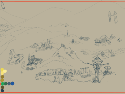
An examination and self-review: My Fallout: New Vegas piece

Artwork, Stream News

Welcome to 2022!

That means adding another gallery page, uploading some recent content, and this, me writing more about art.

Sometime in November I was approached by a friend who wanted a large-scale piece done for a game we both love. Fallout: New Vegas is the best Fallout game, and in my book is one of the best games period. It hit that sweet spot for me: That sickly sweet nostalgia for an America that never existed, the barren world populated by lively characters who were making ends meet, the morally grey choices that had a measurable impact on the world. And the ENDING! That ending is impossible top for me. It’s the most replayable RPG ever made if only for the staggering array of different outcomes of your various factions and allies. A true masterpiece, the “Fury Road” of Fallouts, you could say.

Step 1: Concept

We started with a seemingly simple and humble idea: a landscape drawing of the New Vegas, highlighting a few important places within the game world and acting as an attractive piece of wall art. After making the crucial decision of the final size and resolution of the piece, I started with this very simple concept:

I then got some feedback from the client, and we starting thinking about how this would look, and what details were important (and which could be left out completely). What colors would be used? How much detail should be added?

Step 2: Blocking Out Space and Making a Color Plan

Alright! Now we had more than an idea: there was a PLAN. And thus began the long process of getting a rough draft completed. I call v2 a ‘color draft’, something intended to guide the overall look of the piece. At this point you can step back from the piece and do a “squint test”: narrow your eyes and take in the overall shape of the piece. Ask questions like: where is the focal point? Does my eye want to carry through and look at the whole piece? Do any parts stand out as being out of place, or too bright, or disruptive to the pieces flow? Now is the time to correct issues like that!

So now in v3 we can see that we are deciding less on color choice and more on *placement*. Even though I am laying down inks, this is still a rough draft. In retrospect, I could have directly went in with references and drawn everything ‘perfectly’ the first time around. This was a learning experience, and I could save myself many hours in the future by referencing up first.

Speaking on color choice, you can see in v3 the first instance of the color palette. It really pays to lock in an attractive palette early, as it will prevent you from encountering garish or sloppy color clashes after you have already spent hours on a piece! My graphic design instincts say “You can always color correct afterwards”, my illustration instincts instead say “Pick the colors consciously and people will notice that choice”. In the end, you are free to do both (color correction AND thoughtful palette choice)

By this version, you can see most of the locations are blocked out. I was still deciding on the most attracting topography for the area, and working on the “final colors” layer. The “final colors” layer was my topmost layer of pixels that would actually be seen in the final piece. In v5 you can see those sorts of inks in the casino in front of the Black Mountain region, and in Helios One. I did the Kings as well!

Step 3: Additional Research Required

At this point I should mention the power of REFERENCES. A project like this could be done from memory if some savant got a hold of a lot of time and a copy of FO:NV, but for everyone else it makes sense to have the best reference available. So, dutifully, and because I believe that once should live and breath their art, I starting playing some more Fallout with the intention of taking lots of pictures.

I took a few screenshots. I told myself “It’s going to be hard to get an overhead angle of every building and landscape element, but I am creative and smart and I will be able to figure it out”. For a single building, that may be true, but as I continued my tour I realized that simply playing Fallout and taking pictures like this was not going to get me where I wanted to be in this piece.

I had high standards, here! I need to know what it looks like from a fantastic vista, not my lowly human frame of reference! I searched around and I found a mod that let you fly the camera around. Here it is for those of you with that very specific interest. It was perfect for my purposes! I could see the Fallout: New Vegas landscape from angles I had never dreamed. True, that means that I saw a lot of developer shortcuts and other jank that was never intended to be seen, but I did not care. The important part is now i had a great sense of scale, placement, and context that I never had before.

So I spent an hour or so jumping from location to location, taking a few pictures of each area. In retrospect, I should have taken WAY TOO MANY PHOTOS because I almost invariably went back to get more details, or better angles. By the end of the project, I have 317 screenshots from this game. I referenced nearly every single one.

Step 4: Ink on Paper

A majority of the preliminary inks are finished in this drawing. At this point some of the art is final (like the dinosaur and the statues, and some of the Strip) and most of it is the rough draft inks from earlier. This is *almost* the final layout of the piece. At this point it is a great time to move stuff around and play with placements and flow. Those colors are not in so you have all the freedom you want to move things around within the visual window, but once you begin to block in color and render it gets harder and harder to move assets around.

Note the color updates for a majority of the piece. It pays to work on the WHOLE piece until it gets to a certain level, then narrow in on details afterwards. Try to keep working in this broad stages and that will prevent you from getting too detailed on a portion of the piece while the rest lingers behind.

The palette has been expanding to accommodate the increased complexity. The closer I get to the end, the more I expand it. Watch to see these palettes multiply, I tended to copy them and plop them down all over the piece. Make sure to keep your palette in IT’S OWN LAYER, so you can easily remove it once you are done with the piece.

The next few versions we start getting more detail oriented. I will make a part 2 for this series, so I can spend more time talking about how I handled these smaller details in a HUGE piece that has many such points of detail. Try scrolling back and seeing how huge of a change occurred. The road to a completed drawing is fraught with changes and tough choices, and the additive effect is that you end up doing a lot of the “work” part of artwork.

Thank you for reading so far. Look out for the second part coming soon! This piece is NOT complete at the time of this writing, but it is so close i can taste it. Check out my streams and I may be working on this very piece, or something equally cool!

It is Impossible To Stop Now

Artwork, Stream News

Hi everyone, guess what? Stopping now is out of the question. Isn’t that great?

Growing is a process that is so baked in to human character, that you do not always feel it happen. Progress is often incremental, and time often passes quickly. When I compare my new work to the old, I see the refinement of my style. Like a piece of land eroded by millions of years of water and tectonics, my mental palette of design choices had settled into something that I can call my own. There are limitations, and there are strengths.

So great, how did I develop that style and why am I so happy with myself all of the sudden? Iterations! Practice! Discipline! And lots of sacrifice. Sacrifice of game nights, of sleep, of time spent with friends.

I am working on my Fallout: New Vegas landscape diligently, and it is looking fantasmic if you ask me.

Work in progress, 2021 by Ben Sutter

My next post will be detailing my process, looking at this drawing from its fuzzy beginnings to a stellar finish. In the mean time, thanks for checking in!

The Devastating Pain of Not Sharing Portfolio, Brutal Excellence

Artwork, Stream News
Thanks for coming.

There are pieces of art I have been working on, feverishly! And what is more, they look really cool and I wish I was able to share them. The pain I feel is the pain of having to keep it to myself.

There is good news, and that news is that there are more commission slots open now. And your work does not have to stay unstreamt unless you have some wild tastes. I still stream, not as often as I could, but just as often as I am able.

I have been messing with NeuralBlender lately, to make all sorts of wacky designs. Lots of these are ripe for iteration and background work. You take a prompt, write it down, and the network iterates it over and over again until you end up with something nightmarish.

Besides this, I have been working on pixel-art, working on the website, setting up an INSTAGRAM like some sort of instagrammer. You may notice that navigation is a little different now and that is because you are a very observant critter! I will be adding a Merch option to the menu soon. Not in love with the way the menu is on mobile but that is a minor quib.

Upcoming improvements:

-A banner for the merch store
-Better Commision page, with more options and updated prices
-Finish more art I can show off. Here is a little horror poster done in a pixelart style (80×120 pixels, 8 colors:)

Thanks for tuning in. Check out the galleries, check out the pixel art, order yourself a shirt, and come back soon! I’ll quit when I’m dead!

If You’re Not Creating For Yourself, What Are You Creating For?

Stream News

It’s been a couple of months. My garden got big and I ate lots of tomatoes. Then the shade and heat won, and I was left with withering stalks. Still, the season was alright, with cucumbers and herbs overwhelming. We even had a few decent melons.

School started for my daughter. She is learning to manage her expectations of humanity… after a year of being home-schooled she is out in the thrashing waters of humanity and she wants to know if people ever calm down and act smart in groups. I really hated to tell her that no, this is the way it is. You can control yourself, and what you think and do (up to a point), but you cannot control everyone else.

Anyway, the title, why do I write things like this? I love creating, and I just want to make piles and piles of things to exist forever until I cannot anymore, whether that be a song or a drawing or an emotion. i have opened up my commissions page for the first time in a very long time and it represents me creating for others as well, sharing and creating things that have depth in their meaning. By doing this I am overcoming a fear of sacrificing more of my time, and part of that is feeling that it is NOT really a sacrifice, but a step forward, and a concrete way to help me continue to create.

Hopefully all of that will give me a deeper bond with my fellow humanity, that is really what my end-goal is here. Making things for people to love, the way that I love making them.

So in other news, I have fallen deep into making pixel artwork. Imagine picking up a program and it changes your creative course! I am speaking of Aseprite, a program that allows me to make animations with some pixel art with amazing ease! Look forward to my pixel art gallery coming soon!

UPCOMING UPDATES: I will be making a new gallery for my pixel art, and a new easier link to the commissions page. Thanks for checking me out, kind reader. I will never get less weird, that is my promise to you.

RECENT UPDATES: Commissions Page is complete! 2021 Gallery updated with many new pieces! Who knew I was making so much this year?

April – May 2021 Updates: Creativity Strained in Allergy Season

Stream News

It’s taken me years and years to learn that sometimes, it’s my allergies that are doing the driving. This time of year seems to always sap my creativity a little, as I have to medicate my insane seasonal allergies away. Even if I do medicate, bad enough days in the lustful Miami Valley can literally incapacitate me. One day in April I sneezed probably 50 times, each one a whiplash-inducing explosion (my sneezes are unfortunately very strong and dramatic). This kind of thing will cause me extremely bad headaches, an inability to concentrate, and generally result in SLOPPY WORK. Oh man I hate it when I do sloppy work!

Anyway I am working through that and I am making good art again. I have held off on doing commissions for now since I really do not have the bandwidth for it yet. It took me working on music to realize that I was just stacking on projects until I had too many; I want controlled growth since that it what I can handle, being a single human and all. In the last year I’ve already done plenty of drawing and style development. I’ve opened a TeePublic storefront so you can order shirts and magnets and stickers with my designs RIGHT ON THEM. I own a few of their high-quality tees and they are really comfy, so thus far I have no qualms about their products!


I am working on getting more designs onto the shop, at least monthly, so check that out! They sell prints as well, and you can order prints through them, but I am currently exploring alternative options to that. Now that I have my vaccinations all done, I feel a lot better about getting out into the world and finding a local printer. I will do a few test prints and then we will sell those myself, probably with it’s own navigation page.

TO DO: I need to update my gallery again. I have been posting everything to my discord but I don’t want ALL of that to end up on the site here. It’s all curated, the gallery here.

TO DO: My commission agreement language is almost finished. It’s lack of bandwidth, but I need to finish that.

I am working on a piece with Jimi Hendrix in it now. Hopefully I will finish soon! Thanks for the support, everyone. Do it for Fauntleroy.

Sexual Liquid

Updating Godrod.org

Coloring Cuisine, Stream News

The gallery has been updated with a nice selection of what I have done this year. There is a lot I have left out, but what is there should give you an idea of the growth that I have been going through as an artist and otherwise.

Due to technical limitations, I am not getting music on the stream yet. I will continue to practice as much as my left wrist will allow. I’m about 10 weeks out from surgery on the left wrist, about 5 months out from the right wrist. Having the use of my wrist is amazing! I can draw and play and cook and love and clap and climb and have confidence again. Yay!

Priorities for 2020: Now that I more confidence in what I am doing, I plan on selling certain designs on T-shirts. I want to see what they look like and how the return/payment options are before I commit to a certain vendor. Look out for those, I love wearing art, it can help justify the art as being ‘useful’ as clothing if the pragmatic part of your brain tends to do the driving.

Thanks for checking out godrod.org. We have fun here.