
Welcome to 2022!
That means adding another gallery page, uploading some recent content, and this, me writing more about art.
Sometime in November I was approached by a friend who wanted a large-scale piece done for a game we both love. Fallout: New Vegas is the best Fallout game, and in my book is one of the best games period. It hit that sweet spot for me: That sickly sweet nostalgia for an America that never existed, the barren world populated by lively characters who were making ends meet, the morally grey choices that had a measurable impact on the world. And the ENDING! That ending is impossible top for me. It’s the most replayable RPG ever made if only for the staggering array of different outcomes of your various factions and allies. A true masterpiece, the “Fury Road” of Fallouts, you could say.
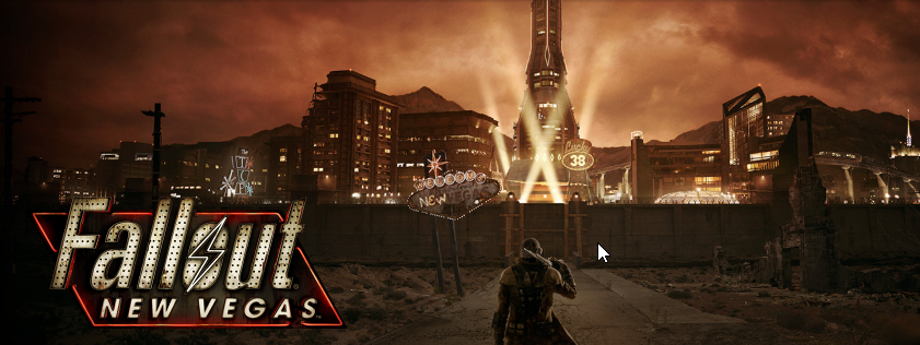
The Fallout: new Vegas Steam page banner.
Step 1: Concept
We started with a seemingly simple and humble idea: a landscape drawing of the New Vegas, highlighting a few important places within the game world and acting as an attractive piece of wall art. After making the crucial decision of the final size and resolution of the piece, I started with this very simple concept:
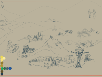
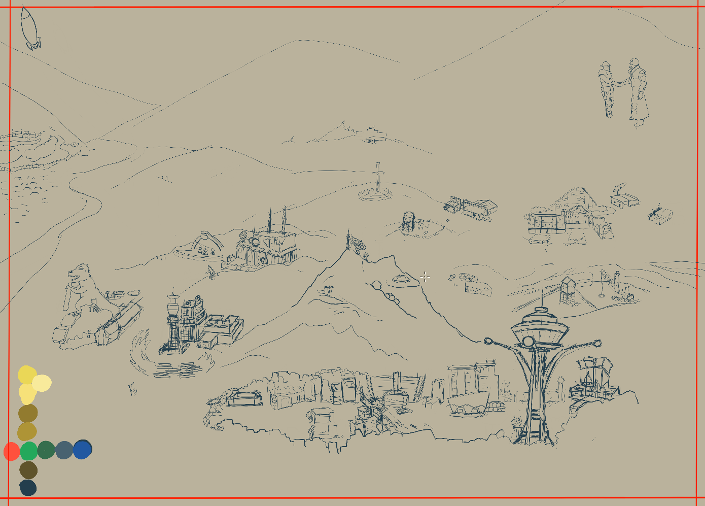
version 0 of the piece, one step beyond just *thinking* about the idea
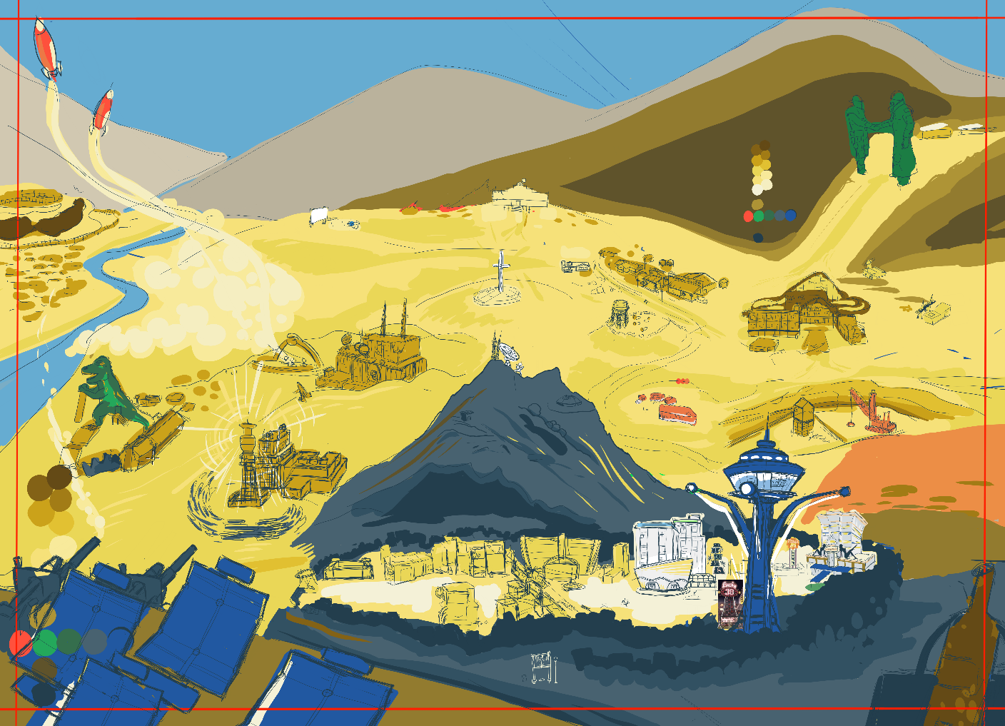
version 1 of the piece, once we decided on more specifics
I then got some feedback from the client, and we starting thinking about how this would look, and what details were important (and which could be left out completely). What colors would be used? How much detail should be added?

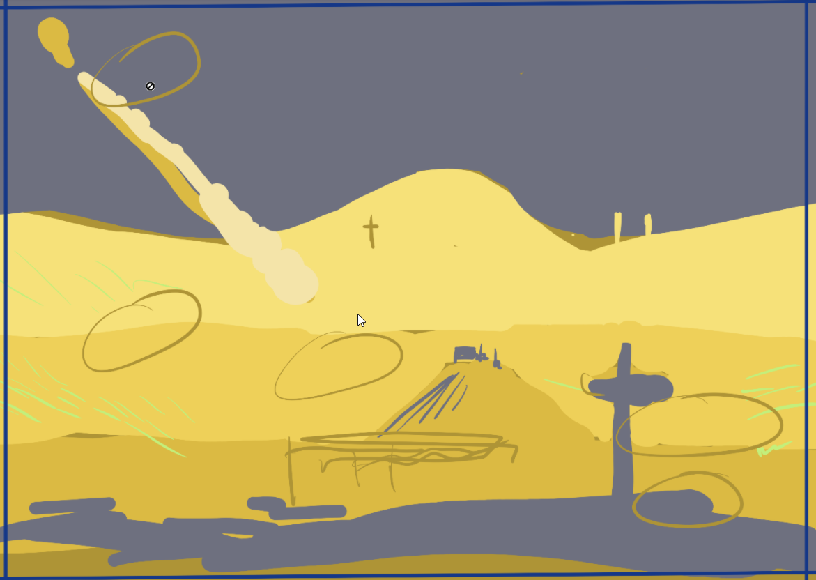
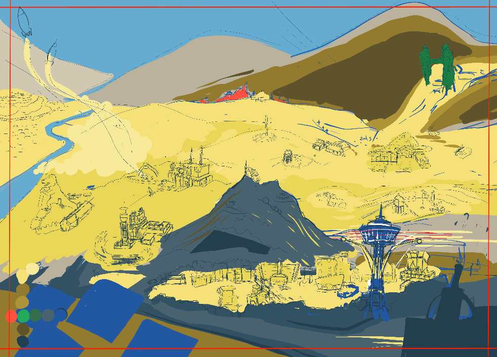
v2. You can see where some more contrast and coloring choices were made at this point.
Step 2: Blocking Out Space and Making a Color Plan
Alright! Now we had more than an idea: there was a PLAN. And thus began the long process of getting a rough draft completed. I call v2 a ‘color draft’, something intended to guide the overall look of the piece. At this point you can step back from the piece and do a “squint test”: narrow your eyes and take in the overall shape of the piece. Ask questions like: where is the focal point? Does my eye want to carry through and look at the whole piece? Do any parts stand out as being out of place, or too bright, or disruptive to the pieces flow? Now is the time to correct issues like that!
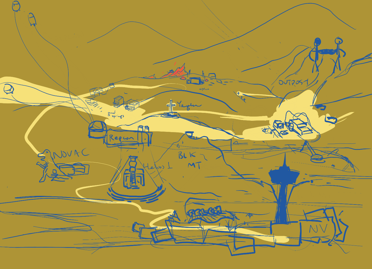
v3, the beginnings of the rough draft. The colors were temporarily muted to make tracing shapes easier.
So now in v3 we can see that we are deciding less on color choice and more on *placement*. Even though I am laying down inks, this is still a rough draft. In retrospect, I could have directly went in with references and drawn everything ‘perfectly’ the first time around. This was a learning experience, and I could save myself many hours in the future by referencing up first.
Speaking on color choice, you can see in v3 the first instance of the color palette. It really pays to lock in an attractive palette early, as it will prevent you from encountering garish or sloppy color clashes after you have already spent hours on a piece! My graphic design instincts say “You can always color correct afterwards”, my illustration instincts instead say “Pick the colors consciously and people will notice that choice”. In the end, you are free to do both (color correction AND thoughtful palette choice)

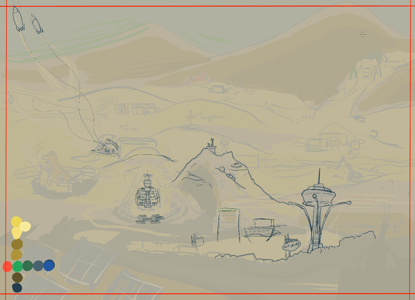
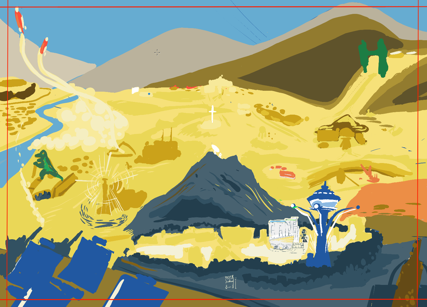
v5, getting more advanced now!
By this version, you can see most of the locations are blocked out. I was still deciding on the most attracting topography for the area, and working on the “final colors” layer. The “final colors” layer was my topmost layer of pixels that would actually be seen in the final piece. In v5 you can see those sorts of inks in the casino in front of the Black Mountain region, and in Helios One. I did the Kings as well!
Step 3: Additional Research Required
At this point I should mention the power of REFERENCES. A project like this could be done from memory if some savant got a hold of a lot of time and a copy of FO:NV, but for everyone else it makes sense to have the best reference available. So, dutifully, and because I believe that once should live and breath their art, I starting playing some more Fallout with the intention of taking lots of pictures.
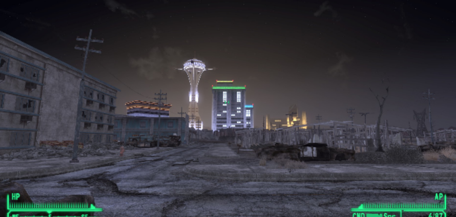
Vegas, from outside Vegas, at ground level
I took a few screenshots. I told myself “It’s going to be hard to get an overhead angle of every building and landscape element, but I am creative and smart and I will be able to figure it out”. For a single building, that may be true, but as I continued my tour I realized that simply playing Fallout and taking pictures like this was not going to get me where I wanted to be in this piece.

This was the photo I took where I realized that this type of photo reference would not work.
I had high standards, here! I need to know what it looks like from a fantastic vista, not my lowly human frame of reference! I searched around and I found a mod that let you fly the camera around. Here it is for those of you with that very specific interest. It was perfect for my purposes! I could see the Fallout: New Vegas landscape from angles I had never dreamed. True, that means that I saw a lot of developer shortcuts and other jank that was never intended to be seen, but I did not care. The important part is now i had a great sense of scale, placement, and context that I never had before.
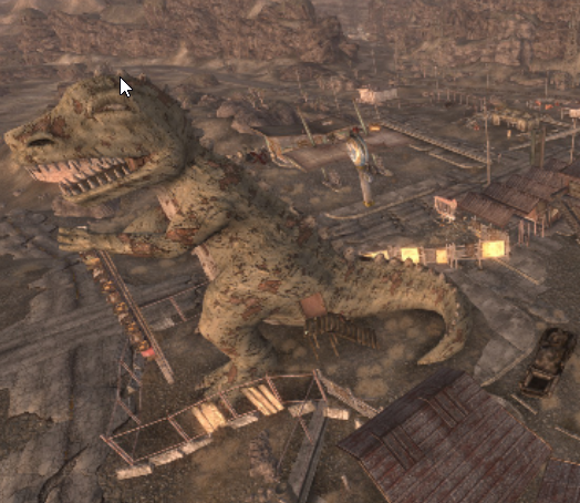
Now THAT’S an overhead view of a dinosaur!
Shots like this are AMAZING. It would have been nearly impossible for me to capture how solid and imposing these statues are without a reference such as this.
So I spent an hour or so jumping from location to location, taking a few pictures of each area. In retrospect, I should have taken WAY TOO MANY PHOTOS because I almost invariably went back to get more details, or better angles. By the end of the project, I have 317 screenshots from this game. I referenced nearly every single one.
Step 4: Ink on Paper
v6, working on inks
A majority of the preliminary inks are finished in this drawing. At this point some of the art is final (like the dinosaur and the statues, and some of the Strip) and most of it is the rough draft inks from earlier. This is *almost* the final layout of the piece. At this point it is a great time to move stuff around and play with placements and flow. Those colors are not in so you have all the freedom you want to move things around within the visual window, but once you begin to block in color and render it gets harder and harder to move assets around.
v7, more color blocking, locking in placements and inks
v8, fruits of the labor of color blocking.
Note the color updates for a majority of the piece. It pays to work on the WHOLE piece until it gets to a certain level, then narrow in on details afterwards. Try to keep working in this broad stages and that will prevent you from getting too detailed on a portion of the piece while the rest lingers behind.
v9, in my opinion where it finally starts to shape up
The next few versions we start getting more detail oriented. I will make a part 2 for this series, so I can spend more time talking about how I handled these smaller details in a HUGE piece that has many such points of detail. Try scrolling back and seeing how huge of a change occurred. The road to a completed drawing is fraught with changes and tough choices, and the additive effect is that you end up doing a lot of the “work” part of artwork.
Thank you for reading so far. Look out for the second part coming soon! This piece is NOT complete at the time of this writing, but it is so close i can taste it. Check out my streams and I may be working on this very piece, or something equally cool!