

Hi everyone, I’m writing again! The piece has been completed, and I can now go into all the details about the process! Just like last time, I will speak about the progression, my thought process, and what details I chose to add or omit. Let’s take a look!
v10. 2022 godrod studios, Ben Sutter
We left on version 9, and version 10 is not all that different from afar. However, this is the point where the placement and coloration was more or less set. I decided begin the long process of inking the piece. I went to my sloppy rough draft inks that I used to block the piece out, set them to a lower opacity (20-50% depending on the colors beneath it) and went in with a finer brush. All that mattered at this point was getting in the fine lines. I would go by my original inks, while looking at a photo reference. In some cases, I would literally plop the reference on the piece and trace over portions of it. I did that for maybe 15% of the linework, but most of it was done by hand.
The strip was one of the first areas where I started inking in. I also did the Casino signs to help me lock in the style I was looking for.
v11, godrod studios, Ben Sutter 2022
I moved up and around, inking in all the areas in their final positions. In version 11 I completed the rest of the Strip, REPCONN, some of Goodsprings, and more. I blocked in a little color on the strip to make sure my dark areas were not disruptive. These next few versions look like tiny changes, but it was the backbone of everything that was yet to come. If we zoom in on the REPCONN facility, we can see the differences that an hour of linework can make:
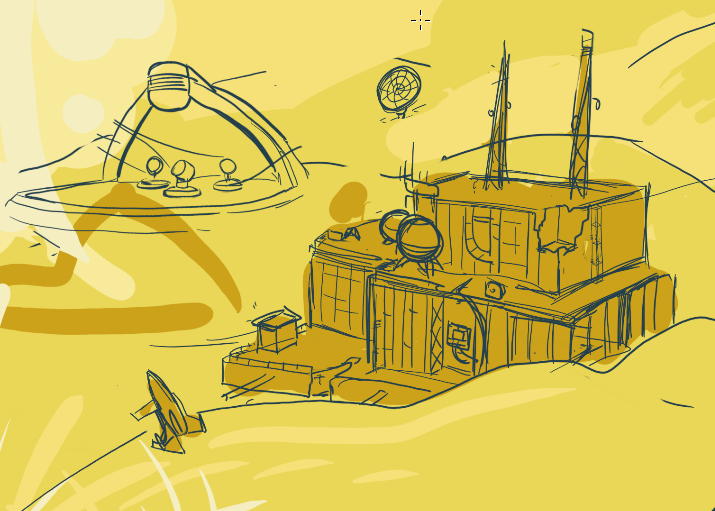
The rough inks, to establish scale and color 
Final inks. Much finer lines, much cleaner presentation. 
Once we hit v12, the colors help define edges, and reduce the need for thick outlines
See the difference between the rough and final drafts? It’s pretty major. I think I could save myself time in the future by keeping my rough drafts even rougher. You can see in the third image above that the established palette was paying dividends, allowing me to quickly describe the space without having to rely heavily on references for colors.
v12, godrod studios, Ben Sutter 2022.
Step 5: Giving New Vegas Weight
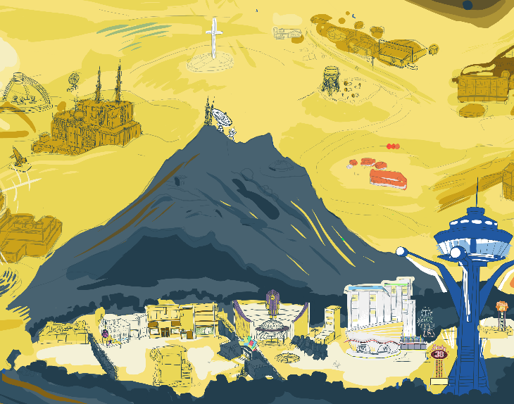
Now we are starting to see some leaps and bounds in terms of settling on detail! At this point, most all of the linework has been completed. This includes the solar panels (but not the guns) in the foreground. Clockwise from the Strip, I have completed the major locations except the Fort, Nipton, Primm, and Quarry Junction. I also realized around this time that the white cross in the center of the piece was in the wrong location; in the end it was cut from the piece, since moving it would create too much interest smashed into the right side of the piece.
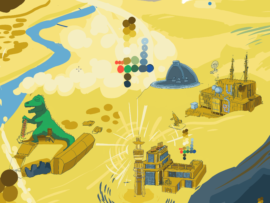
I inked and colored all of this area at once. Note the unfinished town by the dinosaur statue

v13, godrod studios, Ben Sutter 2022
There was, at this point, what I like to call the “work” part of “artwork”. There was lots of linework that took place in very small spaces, so progress felt very slow. I would take a break on one area and work on another if I got restless. Often during the hop from version 13 to 15, I would find myself contouring the land, trying to make each town feel like an attractive space of its own. At some point I picked up all of Goodsprings and shifted it to the left, and I used that time to cut the Yangtze memorial cross out of the piece. I also shifted the brown bottle in the foreground into the frame a little bit, since it was interesting and recognizable.
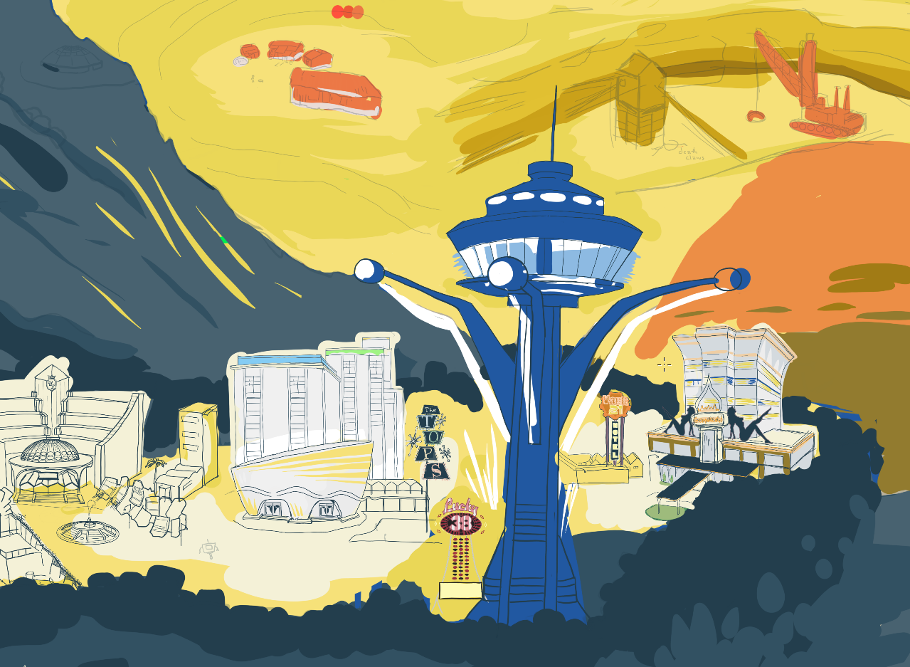
In this period of time, I did a great deal of work on the Fort, the foreground elements, and in tightening up my colors. We decided to add a little bit of flavor to Red Rock Canyon, which was not an original plan. The addition of the red color was welcome though, and it let us add a little more Fallout flavor to the piece. What was once intended to be just a red cliff turned into a very neat visual element, that also steers us through the piece via colors (more on that at the end!) I thought I was almost done at this point, but I had 5 more versions left!
v15, godrod studios, Ben Sutter 2022
Step 6: One Million Finishing Touches, and a discussion on Palette
By this point I had been working on the piece for several weeks. Deciding that I needed to wrap this up, I started to add details. It was time to add characters populating the world, shade and light. Throughout all of it, I was happy I had the foresight to start a palette early, as it greatly reduced friction. I didn’t have to stop and think about every new city or landscape portion; I looked at the palette and applied it as needed. There are, of course, a few off-label colors, primarily in signage and the strip, but for the most part the entire final drawing is limited to the 28 colors you see here:

6 in the “red” group
3 in the green group
7 in the blue group
The brown yellows were the most diverse color group since they had so much to describe. They are used for buildings, the desert, the mountains, and more. I chose the colors to be moderately desaturated, for two reasons. One, I think that it reflects the mood and the actual darkness of the game itself. Two, bright yellows can appear gaudy and bright if they are not mixed with some gray, especially when they are printed! In addition, the desaturated colors will mix well into browns as you add more and more black into the mix. As a result, the piece has a harmony to it from the continuous spread of colors from the bright white-yellow to the darkest browns.
The reds I called “Sloan reds”, since I came up with the colors while working on the rusted and painted metal that made up that small town. Red was sparsely used in this piece, but when we look at the finished piece we can see that it had an impact in the way it draws attention across the piece diagonally.
The blues were vital for shading the mountain, New Vegas Strip, and the foreground. Most of the linework was done in the darkest blue color. I try to avoid using straight-up black lines, since they end up standing out too much. I ended up using blue for anything that I needed to describe as glass, metal, or water.
v16, godrod studios, Ben Sutter 2022
v18, godrod studios, Ben Sutter 2022
The versions look really close to one another now, so I will skip ahead from v16 to v18. The big differences are in the landscape near the statues in the back, the glow-up of the Lucky 38 tower (the big blue one), and making the Strip look more lived-in and full of life. I also was going in, adding additional shadows and linework. You can see that I started adding hatchwork into the landscape, blending areas together and making the piece look more unified. It can be a struggle to take so many disparate elements and make a single composition with them.

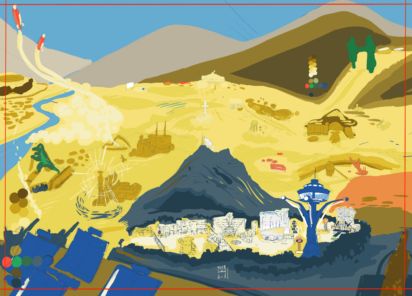
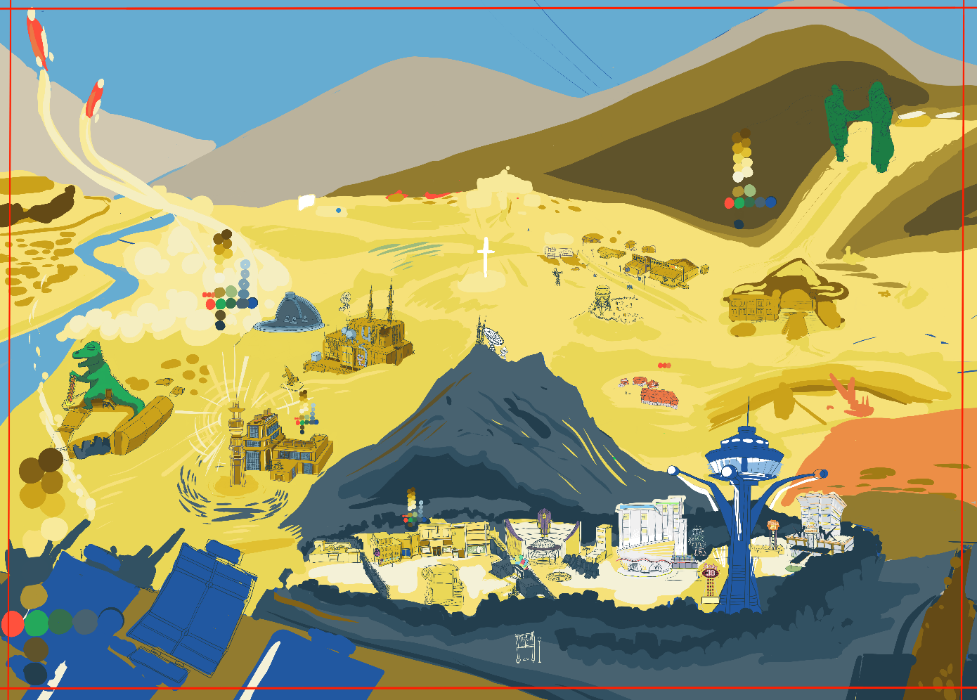
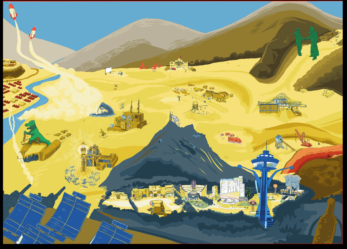
v20, Ben Sutter 2022, godrod studios. This is the final!
All of that work got us to here! While I am excited to speak about the final, I think this article is already very long. I will follow up soon with a short discussion about the color choices, and my goals in getting the eye to wander over the piece. Thanks for reading! Please check out the rest of my work, send me a message, leave a comment, order a drawing for yourself!